
1.800.836.7581


Information & Quote Request
 View Our Tradeshow Catalog
 Current Promotions


 Testimonials & Case Studies


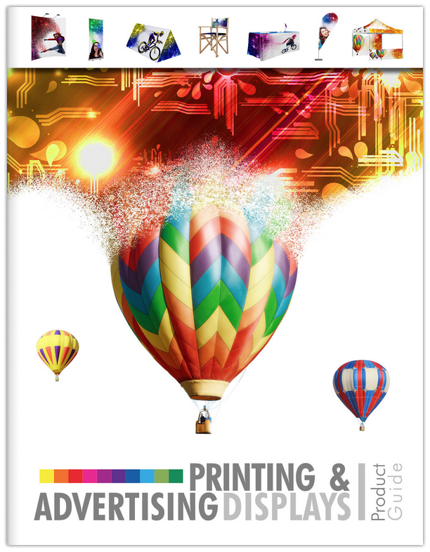
Printing & Advertising Displays Product Guide
Learning Center & Downloads Getting Direction from Above
ColorPage was asked to redesign the aisle signs at Mother Earth’s Storehouse in Kingston. This popular market is known for providing the very best organic and all-natural products. The market’s existing aisle signs lacked labeling and underutilized the branding opportunity. The ColorPage design team assessed the existing signage and provided a few design concepts for consideration. The result was custom aisle signage with bold aisle numbers and easy to read labeling. In addition, the custom shape was routered to enhance
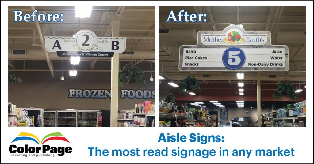
Before and After signs drafted and created by our in-house graphic designers.
We have all looked up at one time or
The labeling descriptions on your aisle signs should be easy to read with good contrast between the characters and the background color they appear on (generally black letters on white background work best). Your labels need to be large enough to be read from a distance and brief enough that the average reader can grasp the message quickly. A good rule of thumb is for every ten feet in distance a reader is from your sign your character height needs to be one inch tall. So, for example if you want your customers to read your aisle sign labeling from thirty feet away the characters should be a least 3” tall.